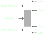
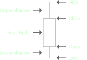
The Candle chart consists of candle-shaped bars, or "candles". The top and the bottom sides of a candle indicate the high and the low prices registered on the aggregation period. The lower and the upper sides of the candle body are used to indicate the open and the close prices, respectively.
Algorithm
A candle is outlined in the "border-up" color if the close price is greater than the open price on the current aggregation period. If it is less, the candle is outlined in the "border-down" color. If the open and the close prices on the current aggregation period are equal, the candle is outlined in the "neutral-tick" color.
The candles can be filled with the "fill-up" and the "fill-down" colors, based on their open and close prices. If the close price is greater than the open price, the fill-up color can be applied to the candle, otherwise the fill-down color can be used. Filling the downtick candles is enabled by default, however you can disable this option and also customize the color scheme using the Appearance Settings.
Note that zooming out too far on a Candle chart makes it harder to distinguish candle borders and fill colors. In this case, "fill" colors are used for filled candles and "border" colors are used for the unfilled ones.
Sample
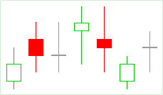
Filled and hollow candles:
Default Colors
|
Component |
Dark L&F |
Light L&F |
|---|---|---|
|
Border Up |
|
|
|
Border Down |
|
|
|
Neutral Tick |
|
|
|
Fill Up |
|
|
|
Fill Down |
|
|