The Bar chart shows aggregated data for open, high, low, and close price values as a vertical line with two horizontal dashes. The bottom end of the line indicates the low price and the top of the line indicates the high price. The left-hand dash is used to show the open price and the right-hand dash shows the close price.
Algorithm
A bar is shown in the "up-tick" color if the current close price is higher than the previous close. Conversely, if it is lower, the bar is displayed in the "down-tick" color. If these are equal or if the bar is the first on the chart, the bar is then shown in the "neutral-tick" color.
You can customize the color scheme of the Bar chart. For more information, see the Appearance Settings article.
Sample
Bar chart
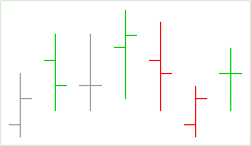
Bar breakdown:
Default Colors
|
Component |
Dark L&F |
Light L&F |
|---|---|---|
|
Up Tick |
|
|
|
Down Tick |
|
|
|
Neutral Tick |
|
|