Description
Before you start, watch this detailed video.
The Monkey Bars chart mode displays price action over the time period at specified price levels.
The data is accumulated on the chart's time period. When the time period is compound (e.g., 3 Months, 4 Years), it is divided into unit periods (e.g., 1 Month, 1 Year), and the data is accumulated on each one.
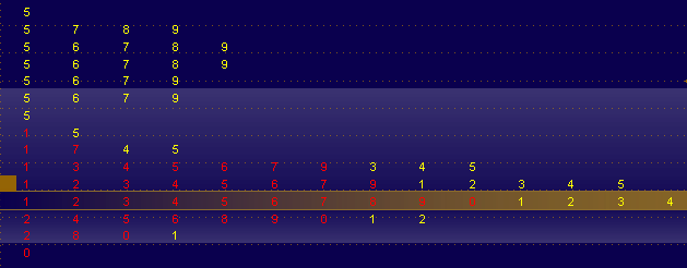
The time period is split into aggregation periods, each one is assigned a digit. If a certain price or a price range is traded over a given aggregation period, it is assigned the corresponding digit. The first aggregation period is assigned 1, the next is assigned 2 - and so forth (up to 10, which is displayed as 0). Note that if the number of aggregation periods exceeds 10, each next ten is also represented by a sequence of digits starting with 1 but shown in a different color. The sequence of colors used to distinguish the tens is shown in the left upper corner of the chart.
The longest row of Monkey Bars defines the price level, which was the most frequent during the specified time period; this level is called Monkey Bar (MB). If there are several equally long rows that fit this description, the system chooses the closest to the price mid-range. Should the rows be at the same distance from the mid-range, the system recognizes the lower one as the Monkey Bar. The price range surrounding the MB level where the specified percentage of the trading activity took place for the specified time period is called The Playground (PG).
Note that the volume subgraph is turned off for the Monkey Bars chart mode.
To customize the Monkey Bars chart, use Appearance Settings.
Sample
The Monkey Bars Chart: