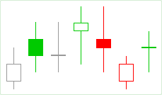
Visually, the Candle Trend chart resembles closely the Candle chart. However, their coloring algorithms are different. The coloring is applied based on the open and the close prices on both the current aggregation period and the two adjacent aggregation periods.
Algorithm
A candle is outlined in the "border-up" color if the current close price is higher than that on the previous time period. Conversely, if it is lower, the candle is outlined in the "border-down" color. If the two close prices are equal or if the candle is the first on the chart, the candle is outlined in the "neutral-tick" color.
If a candle outlined in the "border-up" color has the close price lower than the open price, it is filled with the "fill-up" color. Otherwise, it is left unfilled.
If a candle outlined in the "border-down" color has the close price lower than the open price, it is filled with the "fill-down" color. Otherwise, it is left unfilled.
If a candle outlined in the "neutral-tick" color has the close price lower than the open price, it is filled with the "neutral-tick" color. Otherwise, it is left unfilled.
You cannot disable candle filling for the Candle Trend chart, as it is part of the coloring algorithm. To customize fill and color settings of the Candle trend chart, use the Appearance Settings.
Note that zooming out too far on a Candle Trend chart makes it harder to distinguish candle borders and fill colors. In this case, "fill" colors are used for filled candles and "border" colors are used for the unfilled ones.
Sample
Default Colors
|
Component |
Dark L&F |
Light L&F |
|---|---|---|
|
Border Up |
|
|
|
Border Down |
|
|
|
Neutral Tick |
|
|
|
Fill Up |
|
|
|
Fill Down |
|
|